Input settings
Input settings can hold a value and are configurable by merchants.
Input settings are generally composed of standard attributes, and there are two categories:
To learn how to access the values of these settings for use in your theme, refer to the settings overview.
TipIf you want to add informational elements to your settings display, like a heading, then refer to Sidebar settings.
Standard attributes
The following are standard attributes across input settings. However, depending on the input type, there might be extra attributes or some might not apply:
| Attribute | Description | Required |
|---|---|---|
type | The setting type can be any of the basic or specialized input setting types. | Yes |
id | The setting ID is used to access the setting value. | Yes |
label | The setting label will show in the theme editor. | Yes |
default | The default value for the setting. | No |
Basic input settings
The following are the basic input setting types:
checkbox
A setting of type checkbox outputs a checkbox field. In addition to the standard attributes of an input setting, checkbox type settings have the following attributes:
| Attribute | Description | Required |
|---|---|---|
info | The setting information tip. Usage same as label. | No |
You can use these fields for toggling features on and off, such as whether to enable the price of the button of the add-to-cart.
For example, the following setting generates the following output:
{
  "type": "checkbox",
  "id": "enable_btn_price",
  "label": {
    "en-US": "Enable variant price on 'Add to cart ' button",
    "zh-CN": "开启加购按钮子款式价格"
  },
  "default": true,
  "info": {
    "en-US": "'Add to cart' button display effect when selecting variants",
    "zh-CN": "选中变体组合时'Add to cart'按钮的展示效果"
  }
}
Output:
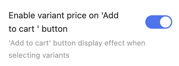
When accessing the value of a checkbox type, data is returned as a boolean.
NoteIf
defaultis unspecified, then the value isfalseby default.
range
A setting of type range outputs a range slider field. In addition to the standard attributes of an input setting, range type settings have the following attributes:
| Attribute | Description | Required |
|---|---|---|
min | The minimum value of the input | No |
max | The maximum value of the input | No |
step | The increment size between steps of the slider | No |
unit | The unit for the input. For example, you can set the px for a font-size slider. | No |
You can use these fields to capture varying numerical values, such as font size.
For example, the following setting generates the following output:
{
  "type": "range",
  "id": "heading_font_size",
  "label": {
    "en-US": "Heading font size",
    "zh-CN": "标题字号"
  },
  "default": 20,
  "step": 1,
  "min": 16,
  "max": 32,
  "unit": "px"
}
Output:
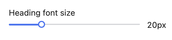
When accessing the value of a range type, data is returned as a number.
CautionThe
defaultattribute is required. Themin,max,step, anddefaultattributes can't be string values. Failing to adhere results in an error.
select
A setting of type select outputs a drop-down selector field. In addition to the standard attributes of an input setting, select type settings have the following attributes:
| Attribute | Description | Required |
|---|---|---|
options | Takes an array of value/label definitions for each option in the drop-down. | Yes |
info | The setting information tip. Usage same as label. | No |
You can use these fields to capture a multi-option selection, such as the cart type.
For example, the following setting generates the following output:
{
  "type": "select",
  "id": "cart_type",
  "label": {
    "en-US": "Cart type",
    "zh-CN": "购物车类型"
  },
  "default": "dropdown",
  "options": [
    {
      "value": "dropdown",
      "label": {
        "en-US": "Dropdown",
        "zh-CN": "下拉弹窗"
      }
    },
    {
      "value": "page",
      "label": {
        "en-US": "Page",
        "zh-CN": "页面"
      }
    }
  ]
}
Output:
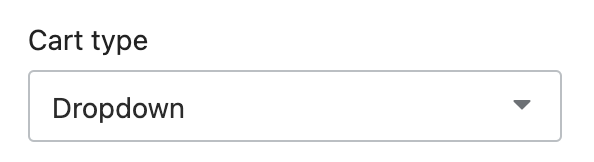
When accessing the value of a select type, data is returned as a string.
PitfallIf
defaultis unspecified, then the empty option is selected by default.
text
A setting of type text outputs a single-line text field. In addition to the standard attributes of an input setting, text type settings have the following attribute:
| Attribute | Description | Required |
|---|---|---|
placeholder | A placeholder value for the input. Usage same as label. | No |
info | The setting information tip. Usage same as label. | No |
You can use these fields to capture short strings, such as titles.
For example, the following setting generates the following output
{
  "type": "text",
  "id": "heading",
  "label": {
    "en-US": "Heading",
    "zh-CN": "标题"
  },
  "default": "Sample",
  "info": {
    "en-US": "Defaults to 'Sample'",
    "zh-CN": "默认为'Sample'"
  }
}
Output:
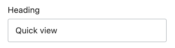
When accessing the value of a text type, data is returned as a string.
textarea
A setting of type textarea outputs a multi-line text field. In addition to the standard attributes of an input setting, textarea type settings have the following attribute:
| Attribute | Description | Required |
|---|---|---|
placeholder | A placeholder value for the input. Usage same as label. | No |
info | The setting information tip. Usage same as label. | No |
You can use these fields to capture larger blocks of text, such as descriptions.
For example, the following setting generates the following output:
{
  "type": "textarea",
  "id": "description",
  "label": {
    "en-US": "Description",
    "zh-CN": "描述"
  },
  "default": "",
  "placeholder": {
    "en-US": "Enter description...",
    "zh-CN": "输入描述..."
  }
}
Output:
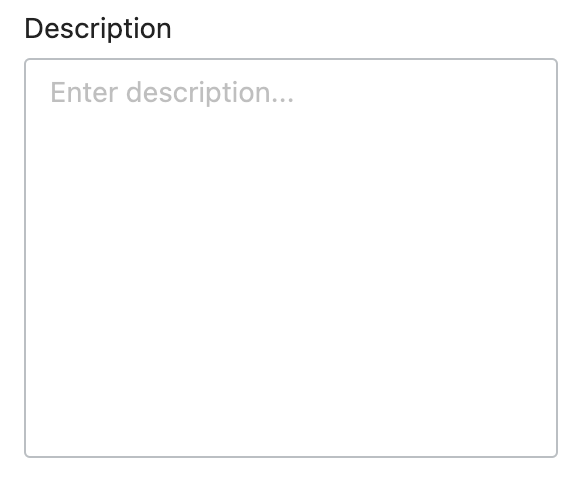
When accessing the value of a textarea type, data is returned as a string.
Specialized input settings
The following are the specialized input setting types:
- article
- blog
- collection
- color
- font_picker
- html
- image_picker
- link_list
- page
- product
- richtext
- spacing
- tags
- url
- video_picker
- video_url
article
A setting of type article outputs an article picker field that's automatically populated with the available articles for the store. You can use these fields to capture an article selection, such as the article to feature on the homepage.
For example, the following setting generates the following output:
{
  "type": "textarea",
  "id": "description",
  "label": {
    "en-US": "Description",
    "zh-CN": "描述"
  },
  "default": "",
  "placeholder": {
    "en-US": "Enter description...",
    "zh-CN": "输入描述..."
  }
}
Output:
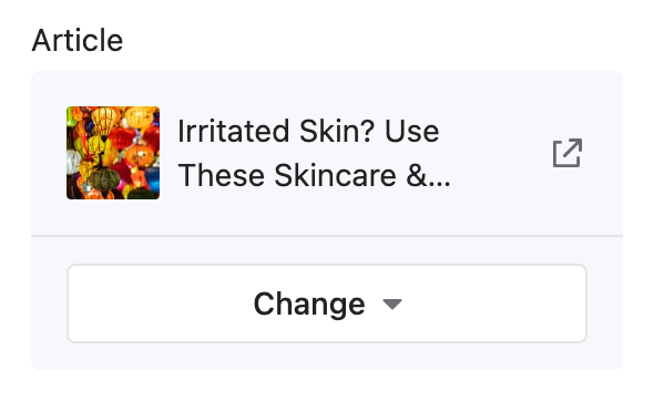
When accessing the value of an article type, data is returned as one of the following:
- A article object.
blankif no selection has been made, the selection isn't visible, or the selection no longer exists.
Note
articlesettings also don't support thedefaultattribute.
blog
A setting of type blog outputs a blog picker field that's automatically populated with the available blogs for the store. You can use these fields to capture a blog selection, such as the blog feature in the sidebar.
For example, the following setting generates the following output:
{
  "type": "blog",
  "id": "blog",
  "label": {
    "en-US": "Blog",
    "zh-CN": "博客"
  }
}
Output:
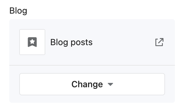
When accessing the value of a blog type, data is returned as one of the following:
- A blog object.
blank, if either no selection has been made or the selection no longer exists.
Note
blogsettings also don't support the default attribute.
collection
A setting of type collection outputs a collection picker field that's automatically populated with the available collections for the store. You can use these fields to capture a collection selection, such as a collection for featuring products on the homepage.
For example, the following setting generates the following output:
{
  "type": "collection",
  "id": "collection",
  "label": {
    "en-US": "Collection",
    "zh-CN": "专辑"
  }
}
Output:
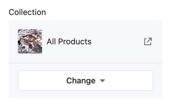
When accessing the value of a collection type, data is returned as one of the following:
- A collection object.
blankif no selection has been made, the selection isn't visible, or the selection no longer exists.
color
A setting of type color outputs a color picker field. You can use these fields to capture a color selection for various theme elements, such as the body text color.
For example, the following setting generates the following output:
{
  "type": "color",
  "id": "body_text_color",
  "label": {
    "en-US": "Body text color",
    "zh-CN": "全局文字颜色"
  },
  "default": "#121212"
}
Output:
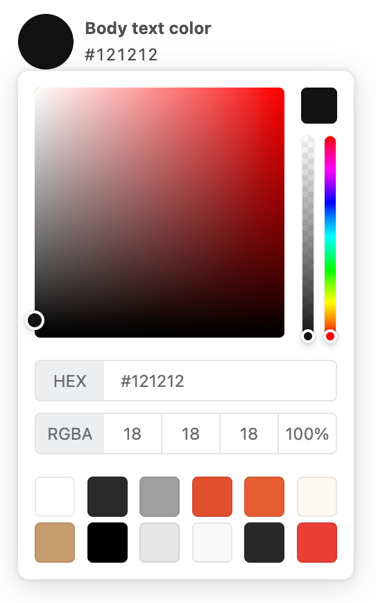
When accessing the value of a color type, data is returned as a string.
font_picker
A setting of type font_picker outputs a font picker field that's automatically populated with fonts from the Shoplazza font library.
You can use these fields to capture a font selection for various theme elements, such as the base heading font.
For example, the following setting generates the following output:
- When using the settings_data.json file, you only need to use a
handleas the default value.
// In settings_data.json file
{
  "type": "font_picker",
  "id": "heading_font",
  "label": {
    "en-US": "Heading font",
    "zh-CN": "标题字体"
  },
  "default": "jost_n4"
}
Same as below:
| Attribute | Description | Required |
|---|---|---|
value_type | Return the type of the value. The valid value is json. | Yes |
// In section
{
  "type": "font_picker",
  "id": "heading_font",
  "label": {
    "en-US": "Heading font",
    "zh-CN": "标题字体"
  },
  "value_type": "json",
  "default": {
    "handle": "jost_n4",
    "fallback_families": "sans-serif",
    "family": "Jost",
    "font_face": "@font-face { font-family: 'Jost';  font-style: normal;  font-weight: 400;  font-display: swap;  src: url(https://fonts.gstatic.com/s/jost/v9/92zPtBhPNqw79Ij1E865zBUv7myjJTVBNIg.woff2) format('woff2');}",
    "style": "normal",
    "style_name": { "zh_CN": "标准", "en_US": "Regular 400" },
    "weight": 400
  }
}
Output:
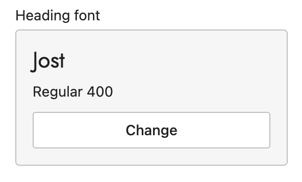
When accessing the value of a font_picker type, data is returned as a font object.
CautionThe
defaultattribute is required. Failing to include it will result in an error. You can find the possible values through the available fonts in the Shoplazza font library.
html
A setting of type html outputs a multi-line text field that accepts HTML markup. You can use these fields to capture custom blocks of HTML content, such as a video embed.
For example, the following setting generates the following output:
{
  "type": "html",
  "id": "html",
  "label": {
    "en-US": "HTML",
    "zh-CN": "HTML"
  }
}
Output:
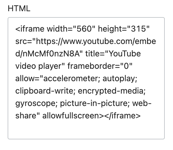
The following HTML tags will be automatically removed:
<html><head><body>
When accessing the value of an html type, data is returned as a string.
NoteUnclosed HTML tags will result in an error. So please make sure you have entered the correct HTML.
image_picker
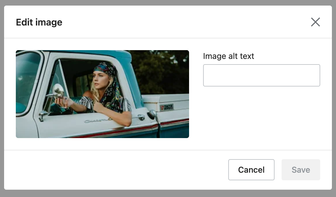
A setting of type image_picker outputs an image picker field that's automatically populated with the available images from the files section of Shoplazza admin, and has the option to upload new images. Merchants also have an opportunity to enter alt text. In addition to the standard attributes of an input setting, image_picker type settings have the following attributes:
| Attribute | Description | Required |
|---|---|---|
info | The setting information tip. Usage same as label. | No |
You can use these fields to capture an image selection, such as logos, favicons, and slideshow images.
For example, the following setting generates the following output:
{
  "type": "image_picker",
  "id": "image",
  "label": {
    "en-US": "Image",
    "zh-CN": "图片"
  }
}
Output:
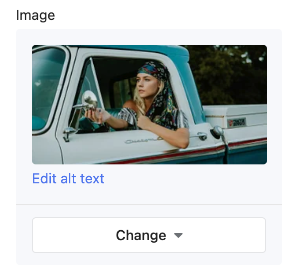
When accessing the value of an image_picker type, data is returned as a string.
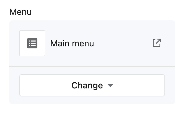
link_list
A setting of type link_list outputs a menu picker field that's automatically populated with the available menus for the store. In addition to the standard attributes of an input setting, link_list type settings have the following attributes:
| Attribute | Description | Required |
|---|---|---|
info | The setting information tip. Usage same as label. | No |
You can use these fields to capture a menu selection, such as the menu to use for footer links.
For example, the following setting generates the following output:
{
  "type": "link_list",
  "id": "menu",
  "label": {
    "en-US": "Menu",
    "zh-CN": "菜单"
  }
}
Output:
When accessing the value of a link_list type, data is returned as one of the following:
- A linklist.
- An empty object, if nothing has been entered.
NoteThe
defaultattribute is optional. However, if you use it, then its value can't be an empty string.
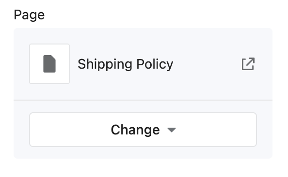
page
A setting of type page outputs a page picker field that's automatically populated with the available pages for the store. You can use these fields to capture a page selection, such as the page to feature content in a shipping policy display.
For example, the following setting generates the following output:
{
  "type": "page",
  "id": "page",
  "label": {
    "en-US": "Page",
    "zh-CN": "页面"
  }
}
Output:
When accessing the value of a page type, data is returned as one of the following:
- A page object.
blankif no selection has been made, the selection isn't visible, or the selection no longer exists.
Note
pagesettings also don't support the default attribute.
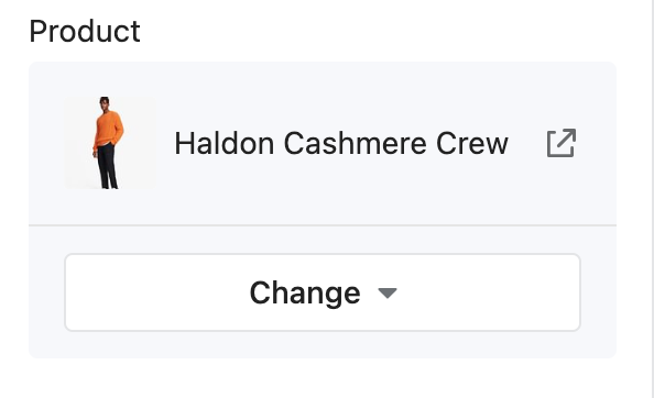
product
A setting of type product outputs a product picker field that's automatically populated with the available products for the store. You can use these fields to capture a product selection, such as the product to feature on the homepage.
For example, the following setting generates the following output:
{
  "type": "product",
  "id": "product",
  "label": {
    "en-US": "Product",
    "zh-CN": "商品"
  }
}
Output:
When accessing the value of a product type, data is returned as one of the following:
- A product object.
blankif no selection has been made, the selection isn't visible, or the selection no longer exists.
Note
productsettings also don't support thedefaultattribute.
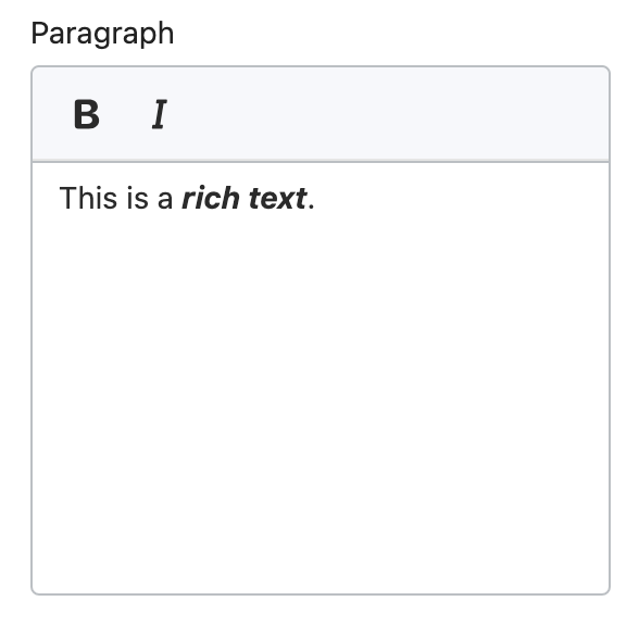
richtext
A setting of type richtext outputs a multi-line text field with the following basic formatting options:
- Bold
- Italic
- Paragraph
In addition to the standard attributes of an input setting, richtext type settings have the following attributes:
| Attribute | Description | Required |
|---|---|---|
info | The setting information tip. Usage same as label. | No |
You can use these fields to capture formatted text content, such as introductory brand content on the homepage.
For example, the following setting generates the following output:
{
  "type": "richtext",
  "id": "paragraph",
  "label": {
    "en-US": "Paragraph",
    "zh-CN": "段落"
  }
}
Output:
When accessing the value of a richtext type, data is returned as a string.
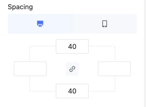
spacing
A setting of type spacing outputs a top, left, right, and bottom field that supports separate configurations of mobile and PC.
You can use these fields to configure the spacing of the section.
For example, the following setting generates the following output:
{
  "type": "spacing",
  "id": "spacing",
  "label": {
    "en-US": "Spacing",
    "zh-CN": "间距留白"
  },
  "default": {
    "pc": {
      "top": "40",
      "right": "",
      "bottom": "40",
      "left": ""
    },
    "mobile": {
      "top": "20",
      "right": "",
      "bottom": "20",
      "left": ""
    }
  }
}
Output:
When accessing the value of a spacing type, data is returned as a string.
Additionally, there's access to the pc and mobile of the spacing.
For example:
PC top: {{ section.settings.spacing.pc.top }}
Mobile top: {{ section.settings.spacing.mobile.top }}PC top: 40
Mobile top: 20tags
A setting of type tags outputs an array field. In addition to the standard attributes of an input setting, tags type settings have the following attribute:
| Attribute | Description | Required |
|---|---|---|
info | The setting information tip. Usage same as label. | No |
{
  "type": "tags",
  "id": "tags",
  "label": {
    "en-US": "Tags",
    "zh-CN": "标签"
  },
  "default": ["Free"]
}
Output:
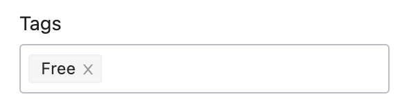
When accessing the value of a tags type, data is returned as an array.
url
A setting of type url outputs a URL entry field where you can manually enter external URLs and relative paths. It also has a picker that's automatically populated with the following available resources for the shop:
- Home
- Collections
- Products
- Articles
- Blogs
- Pages
- Order lookup
- Custom URL
You can use these fields to capture a URL selection, such as the URL to use for a slideshow button link.
For example, the following setting generates the following output:
{
  "type": "url",
  "id": "button_link",
  "label": {
    "en-US": "Button link",
    "zh-CN": "按钮链接"
  }
}
Output:
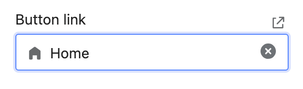
When accessing the value of a url type, data is returned as one of the following:
- An object that contains the selected URL.
- Empty string, if nothing has been entered.
Note
urlsettings also don't support thedefaultattribute.
video_picker
A setting of type video outputs a video picker. The merchant also has the option to upload new videos. In addition to the standard attributes of an input setting, video_picker type settings have the following attributes:
| Attribute | Description | Required |
|---|---|---|
info | The setting information tip. Usage same as label. | No |
For example, the following setting generates the following output:
{
  "type": "video_picker",
  "id": "video",
  "label": {
    "en-US": "Video",
    "zh-CN": "视频"
  }
}
Output:
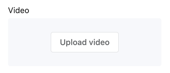
When accessing the value of a video type, data is returned as one of the following:
- A video object.
nil, if no selection has been made.
video_url
A setting of type video_url outputs a URL entry field. In addition to the standard attributes of an input setting, video_url type settings have the following attributes:
| Attribute | Description | Required |
|---|---|---|
accept | Takes an array of accepted video providers. Valid values are youtube, vimeo, or both. | Yes |
value_type | Return the type of the value. The valid value is json. | Yes |
placeholder | A placeholder value for the input. Usage same as label. | No |
info | The setting information tip. Usage same as label. | No |
{
  "type": "video_url",
  "id": "video",
  "value_type": "json",
  "accept": ["youtube", "vimeo"],
  "label": {
    "en-US": "Video",
    "zh-CN": "视频"
  }
}
Output:
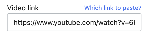
When accessing the value of a video_url type, data is returned as one of the following:
Additionally, there's access to the id and type (youtube or vimeo) of the video.
For example, assuming you're using this video with the above setting, the following Liquid generates the following output:
ID: {{ section.settings.video.id }}
Type: {{ section.settings.video.type }}ID: V4M4m24uNlY
Type: youtubeCreate links
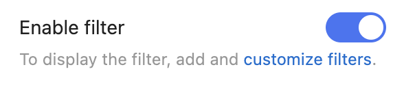
You can add links to the info settings attribute by enclosing the link text in <a> tag and then follow it immediately with the URL in parentheses.
For example, the following setting generates the following output:
{
  "type": "checkbox",
  "id": "show_filter",
  "label": {
    "zh-CN": "开启筛选",
    "en-US": "Enable filter"
  },
  "info": {
    "en-US": "To display the filter, add and <a href='/admin/smart_apps/store/menus' target='_blank'>customize filters</a>.",
    "zh-CN": "展示筛选器需要在后台添加<a href='/admin/smart_apps/store/menus' target='_blank'>筛选纬度</a>。"
  },
  "default": true
}
Output:
Updated 6 months ago